Web design templates are pre-built page layouts, theme files or mockup sets that give a site its structure, spacing and visual style before any custom work begins. Choosing one well saves time; choosing badly creates rework.
This page is the hub for the Web Design category. It explains what templates contain, how to judge them, how to customise them safely and where each deeper guide on this site fits.
What a web design template actually contains
A template is a set of decisions made in advance. At the simplest end it is a static page layout: a header, a content area, a sidebar and a footer, with sizes and colours already chosen. At the other end it is a complete theme for a content management system, with templates for the home page, single posts, archives, search results and error pages, plus global settings for type, colour and spacing.
In the WordPress ecosystem, the Theme Handbook describes the idea plainly: “A WordPress theme represents the design of your website. It can control everything from colors, to fonts, to the entire layout.” The same handbook states that “Block themes are the modern method of building WordPress themes.” That matters for template shoppers, because a block theme exposes its layout, colours and typography as editable settings rather than hard-coded files. The reference is the WordPress Theme Handbook page on what a theme is.
Design mockups form a third kind of template. A mockup is not a working site; it is a picture of one, built so that a designer can drop in a layout and present it to a client. Those are covered in the guide to browser mockup templates, which explains how a browser frame is used to show a design in context.
Whatever the format, a good template bundles four things: a layout system, a type scale, a colour palette and a set of reusable components such as navigation, cards, forms and buttons. Evaluating each of those separately is easier than judging the template as a whole.
Template types and when each one fits
Different projects call for different kinds of template, and mixing them up is a common source of frustration. Four broad categories cover most of what designers meet.
- Static page layouts. Plain HTML and CSS pages suit a small brochure site, a landing page or a prototype. They are easy to understand and fast to load, but every page is edited by hand.
- CMS themes. Themes for platforms such as WordPress suit sites that publish regularly, because content is separated from design and editors can add pages without touching code.
- UI kits and component libraries. These supply buttons, forms, cards and navigation as building blocks. They suit teams assembling a custom interface that still needs a consistent look.
- Presentation mockups. These are image-based files used to show a finished design inside a device or browser frame. They are for presenting work, not for running a site.
The choice should follow who will maintain the site. A solo designer who rarely updates pages can live with static files. A small business that posts weekly needs an editor-friendly theme. A product team with many screens benefits from a component library whose rules are written down.
It also helps to consider lifespan. A campaign page that will be retired after a season has little reason to carry a heavy framework, while a site meant to last for years should rest on a theme that is actively maintained and documented. Checking when a template was last updated, and whether its documentation explains how to customise it, is a quick way to estimate how much support to expect later.
Finally, weigh flexibility against speed. Highly opinionated templates get a site live quickly but resist change, while minimal starter themes ask for more design work and reward it with fewer constraints. Neither is better in the abstract; the right one is the one whose trade-off matches the time, skills and budget actually available.
How to choose a template that fits the project
The best template is the one whose defaults already match the project. Changing a layout that was built for a different purpose costs more than starting with a close match, so the first step is to write down what the site needs: the page types, the content volume, the audience devices and the features that cannot be compromised.
A short selection process works for most projects:
- Map the content first. List the page types before opening a template gallery. A site with long articles needs a different reading layout from a portfolio of images.
- Check the structure on a narrow screen. A template that only looks good on a wide monitor will cost effort later. The guide to responsive web design explains how fluid grids, breakpoints and viewports are meant to behave.
- Look at the type. Body text size, line length and heading hierarchy decide how comfortable pages feel to read. The principles are set out in the guide to web typography.
- Inspect the colours. Decorative palettes often fail contrast requirements once real content is added. The guide to choosing a website color scheme covers readable combinations.
- Read the licence. Terms differ for personal sites, client work and resale. This site hosts no template files, so any licence must be read on the provider’s own page before use.
The table below turns several of these checks into measurable thresholds taken from published standards.
| Check | Measurable threshold | What it protects |
|---|---|---|
| Body text contrast | Contrast ratio of at least 4.5:1 | Readability for people who cannot read faint text |
| Large text contrast | Contrast ratio of at least 3:1 | Headings and other large-scale text |
| Pointer target size | At least 24 by 24 CSS pixels | Buttons and links that can be hit accurately |
These accessibility values come from the W3C’s Understanding Contrast (Minimum) and Understanding Target Size (Minimum) pages.
Interface components such as borders, icons and form controls have their own rule in Understanding Non-text Contrast, which asks for a contrast ratio of at least 3:1 against adjacent colours. Performance has published thresholds too.
| Metric | Recommended threshold | What it protects |
|---|---|---|
| Loading speed (LCP) | Within 2.5 seconds | Perceived loading performance |
| Interactivity (INP) | 200 milliseconds or less | Responsiveness to taps and clicks |
| Visual stability (CLS) | 0.1 or less | Content that does not jump while loading |
The loading values come from web.dev’s Web Vitals guidance.
A template that claims to be accessible or fast should be tested against these numbers on the real, populated page rather than judged from a demo screenshot.
Planning layout before touching the visual layer
Many template projects go wrong because the visual style is picked before the page structure is understood. A template’s header, hero, card grid and footer arrangement are a structural claim about what matters on each page. If that claim does not match the content, no amount of recolouring repairs it.
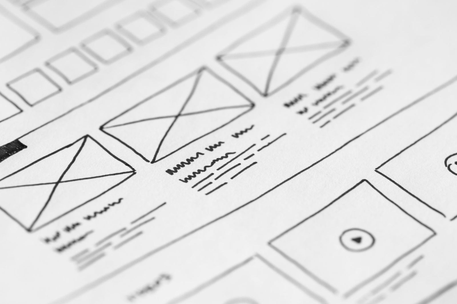
A wireframe is the cheapest way to test the claim. It is a plain, low-detail sketch of each page type that shows where content blocks sit and how they are ordered. The guide to the website wireframe process describes how to draw one and what to leave out. Laying a wireframe next to a candidate template quickly shows whether the blocks line up or whether too many sections would need to be removed, merged or invented.
Reading the template’s page list is also instructive. A template that ships with many specialised page layouts, such as team, pricing, case study and event, hints at the kind of site it was designed for. If most of those layouts have no counterpart in the project, the template carries weight that will need pruning, and unused sections often leave behind styles and scripts that slow every page.
Navigation deserves its own pass. Count the top-level sections the site needs, then check how the template handles that number on a phone. A menu designed for few links may collapse awkwardly with many, and a template with a mega menu may be excessive for a small brochure site.
Content order on small screens matters as well. Templates that place a sidebar before the main content on narrow viewports push the reason for the visit below the fold. Reviewing the stacking order, not just the desktop view, avoids that surprise.
Finally, check the empty states. Real sites contain pages with no image, titles that run to several lines and menus with long labels. A template that only works with the tidy demo content will look broken once real content arrives.
Customising without breaking the template
Customising a template is safest when changes follow the template’s own structure. Modern themes expose colours, font choices and spacing as named settings, and changing those settings propagates consistently through every page. Overriding individual elements one at a time creates inconsistencies that surface months later.
On the web, a common mechanism for this is the CSS custom property. MDN describes custom properties as entities defined by CSS authors that represent specific values to be reused throughout a document, which is what lets a single colour change flow everywhere the property is referenced. Templates built this way are easier to restyle than those with colours repeated throughout the stylesheet.
A sensible order for customisation looks like this:
- Brand colours and contrast. Replace the palette first, then re-check contrast on text, buttons and links. A brand colour that looks good as a logo fill may not work for body text.
- Type. Swap the font families and sizes next, and check how headings wrap. Different typefaces have different widths, so a heading that fitted in the demo may break onto extra lines.
- Spacing and layout. Adjust spacing values globally before touching individual sections.
- Components. Restyle buttons, forms and cards last, so they inherit the new palette and type automatically.
- Content. Replace demo text and images with real material, then review every page type again.
Keep a record of every change made to a third-party template. When the template is updated, edits made directly in its files can be overwritten. Where the platform supports child themes or site-level style settings, use those instead of editing the original files.
Consistency is the quiet benefit of working inside a system. Nielsen Norman Group’s guidance on usability heuristics states that users should not have to wonder whether different words, situations or actions mean the same thing. That principle is explored in the guide to usability heuristics, and it is the reason a template’s repeated components should stay uniform after customisation.

Components that need extra attention: forms and buttons
Template demos often show forms and buttons in their best light: short fields, generous space and perfect labels. Real use is less forgiving, and these two components carry most of the actions that matter on a site, such as signing up, contacting someone or buying.
Forms should be judged on labelling, error messages, field count and keyboard behaviour. Baymard Institute reports that the average checkout flow in 2024 contains 11.3 form fields and that 17% of users have abandoned due to checkout complexity, which is why unnecessary fields are worth removing. A closer look at labels, validation and layout appears in the guide to web form design.
Buttons are judged on size, state styling and wording. The W3C’s minimum target size is 24 by 24 CSS pixels for pointer inputs, and its enhanced criterion raises that to 44 by 44. A template with small, low-contrast buttons will need to be adjusted. The guide to web button design covers sizes, hover and focus states, and how to write clear labels.
Keyboard focus is a good test of a template’s quality. The W3C states that any keyboard operable user interface should have a mode of operation where the keyboard focus indicator is visible. Pressing the Tab key through a demo page shows quickly whether the template respects that: if the focus ring disappears, the template has removed it, and it must be restored.
Error states are another weak point. Demo files rarely show what happens when a visitor leaves a required field empty or enters an invalid value. The template should show a clear message next to the field, in text rather than colour alone, and should keep what the visitor already typed. If the demo does not show these states, build them before launch rather than discovering the gap after complaints arrive.
Both components should look and behave the same on every page. If the template uses three different button styles for the same type of action, consolidate them before launch so that users learn one pattern.
Testing a customised template before launch
Testing closes the gap between a template that looks right and one that works. A launch checklist keeps the review from depending on memory.
- Performance. Web.dev recommends that Largest Contentful Paint occur within 2.5 seconds, Interaction to Next Paint be 200 milliseconds or less and Cumulative Layout Shift stay at 0.1 or less, measured at the 75th percentile of page loads. Heavy sliders, large unoptimised hero images and many font files are the usual template causes of misses.
- Contrast. Check body text, link text, button labels and placeholder text against their backgrounds, then check interface borders and icons.
- Keyboard use. Tab through every page, confirm a visible focus indicator and make sure menus and dialogs can be operated without a mouse.
- Small screens. Review each page type on a narrow viewport, including the menu, forms and tables.
- Real content. Test with the longest title, the shortest paragraph and the missing image case.
The viewport meta tag is a small item that is often missed. MDN explains that this tag, with width set to device-width, tells mobile browsers to set the width of the viewport to the device’s width, which shows the document at the mobile-optimised size intended. A template without it can render as a shrunken desktop page on phones.
Test again after every plugin or content update. A change to one component can alter layout elsewhere, and automated checks do not substitute for opening the finished pages on real devices.

Where to go next
Templates sit at the meeting point of design and code, and this site covers both sides. Designers who need visual assets can start with the overview of free graphic design resources, which explains how licences for fonts, photos and icons work. Those working on the implementation side will find the fundamentals in the guide to front-end web development, covering HTML, CSS and JavaScript.
This is an independent educational site. It is not affiliated with any template marketplace, theme author, software vendor, standards body or the original owner of this domain, and it does not host or sell template files. Where a standard or a provider is cited, the link points to the primary page so the wording can be checked at the source.
Frequently asked questions
What is the difference between a template and a theme?
The terms overlap. A template usually means a single page layout, while a theme is a full package of templates and styles for a content management system. Both supply structure and style that a site owner customises.
Do web design templates hurt accessibility?
They can, because many are designed to look striking in a demo rather than to meet contrast, target size and keyboard requirements. Testing the populated site against the W3C criteria is the reliable way to find out.
Can a template be customised without writing code?
Often yes. Block themes and many site builders expose colours, fonts and spacing as settings. Deeper structural changes may still need CSS or a developer.
Does this site provide templates to download?
No. This site hosts no template, mockup or font files. It explains how to evaluate and use them, and licences must be read on the provider’s own page.
Should the wireframe or the template come first?
The wireframe. Sketching page structures first makes it much easier to see whether a template fits the content or would need heavy rework.