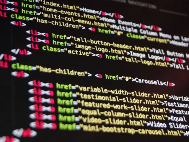
Front-end web development is the craft of building the part of a website that visitors see and use, written in HTML, CSS and JavaScript. This guide maps what each language does, how they fit together and where to go deeper.
Each section below points to a focused guide on this site, so the page works as a starting point for a self-directed learning path.
What front-end development covers
Everything a visitor sees in a browser is delivered through three core technologies, and MDN Web Docs describes how they divide the work. HTML is the markup language that we use to structure and give meaning to our web content. CSS is a language of style rules that we use to apply styling to our HTML content. JavaScript is a scripting language that enables you to create dynamically updating content, control multimedia, animate images and handle interaction.
MDN calls these the layers of a cake, noting that the three layers build on top of one another nicely. The practical lesson is to build in order: get the content and structure right in HTML, add presentation with CSS and only then layer behaviour on top with JavaScript. A page built this way stays usable when a stylesheet or script fails to load, and it is easier to fix because each concern lives in one place.
The browser is the common runtime for all three languages. It downloads the files for a page, builds a structured model from the HTML, applies the matching CSS rules and runs any scripts against that model. Understanding this sequence explains many everyday surprises, such as why a script that runs before an element exists cannot find it, or why a large stylesheet can delay the first appearance of a page.
Front-end work is not only coding. It includes decisions about reading comfort, colour contrast, touch targets, loading speed and how a layout behaves on a phone compared with a desktop monitor. Designers who understand the constraints of the medium produce designs that are cheaper to build, and developers who understand design intent produce results that match it. That overlap is the reason this site covers both disciplines.
Every browser also ships with developer tools, and they are the front-end developer’s main workbench. The inspector shows the live structure of a page and the CSS rules that apply to each element, the console reports errors from scripts, and the network panel lists every file a page requests. Learning to open these tools early turns guesswork into observation, because a problem such as a missing style or a failed request can usually be seen directly instead of inferred.
HTML: structure and meaning
HTML describes what content is. MDN defines it simply: HTML (HyperText Markup Language) is a markup language that tells web browsers how to structure the web pages you visit. A document is built from elements that enclose or mark up parts of the content, so a paragraph, a heading, a list and a table are each represented by their own element.
Choosing the element that matches the content, rather than the one that looks right by default, is the central skill of HTML authoring. MDN’s glossary explains semantics as the meaning of a piece of code. Elements that carry meaning give browsers, search engines and assistive technology something to work with. A navigation block marked as navigation can be skipped or jumped to by a screen reader user, whereas a pile of generic containers offers no such shortcut. The guide to semantic html walks through the elements that describe their content and when each one applies.
Forms are the part of HTML where markup choices have the most visible effect on usability. A field built with the right type can bring up a suitable mobile keyboard, validate its contents and offer a picker, all with no script at all. The reference on html input types compares the available types and explains which fits an email address, a quantity, a date or an identifier.
Links and images deserve the same care. A link should say where it leads, so that link text such as the name of the destination makes sense when read out of context, as screen reader users often do. An image that carries information needs a text alternative that conveys the same information, while a purely decorative image should have an empty alternative so that assistive technology skips it. Giving images explicit width and height attributes also lets the browser reserve space before the file arrives.
A good habit for beginners is to write the HTML first with no styling and read it through as plain text. If the order of headings, paragraphs and lists makes sense without any design, the structure is sound. Layout and decoration can then be added without changing the meaning of the page.
CSS: presentation and layout
CSS controls how the HTML looks. MDN explains that CSS is a rule-based language — you define rules by specifying groups of styles that should be applied to a particular element or groups of elements on your web page. A rule has a selector that picks the elements and a set of declarations that describe their appearance, such as colour, spacing or font.
Three ideas explain most early confusion with CSS. The cascade decides which rule wins when several apply to the same element. Inheritance passes some properties, such as the font, from parents to children. The box model describes how content, padding, border and margin combine to set the space an element takes. Learning these three well prevents the habit of adding more and more specific selectors until something works.
Layout is the part of CSS that changes the most from project to project. Two modern systems cover almost every case. Flexbox arranges items along one axis, and grid controls rows and columns together. The comparison of flexbox vs grid sets out the test MDN suggests: use flexbox when only a row or a column needs control, and grid when both directions matter. Most pages use grid for the overall frame and flexbox inside individual components.
Responsive behaviour is the other half of layout. A page that works only at one screen width fails most visitors, because they arrive on screens of every size. MDN’s responsive design lesson introduces the concepts behind using media queries for responsive design, including mobile-first and breakpoints. A media query, in MDN’s words, is composed of an optional media type and any number of media feature expressions, and it applies a block of styles only when its conditions are met. The guide to css media queries covers the syntax and the patterns that appear most often.
Typography and colour sit alongside layout in the stylesheet. Readable body text depends on a comfortable size, a sensible line length and enough contrast between text and background, and these choices are made in CSS. Consistent values are easier to maintain when they are defined once and reused throughout the stylesheet, rather than repeated as scattered numbers and colour codes. Teams often capture them as a small set of named values for colours, spacing and type sizes, so a change in one place carries through the whole site.
JavaScript: behaviour and interaction
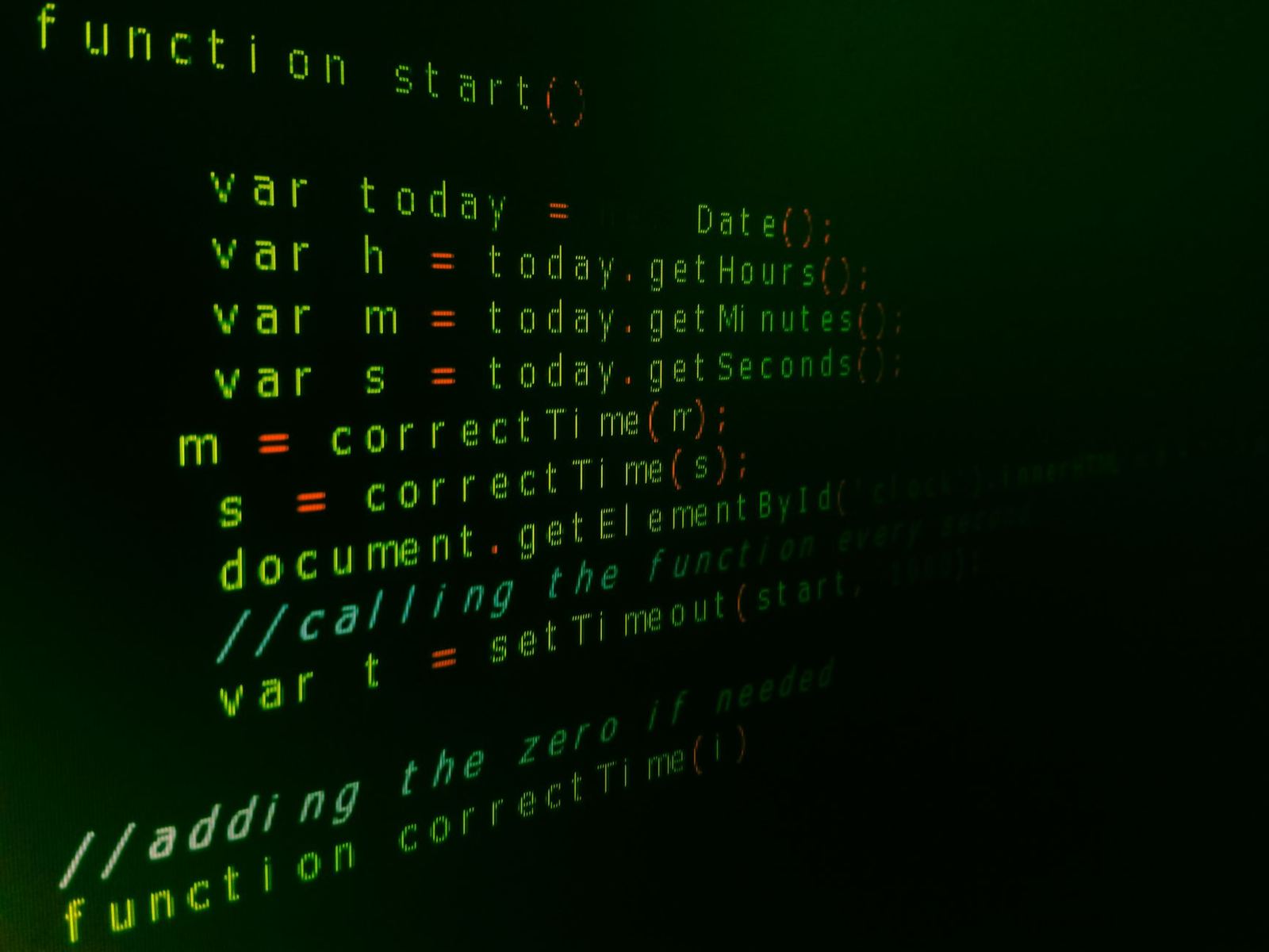
JavaScript makes pages respond. MDN describes it as a scripting or programming language that allows you to implement complex features on web pages, for example timely content updates, interactive maps and animated graphics. Whenever a page does more than display static information, JavaScript is usually involved.
A sensible first goal is to use scripting for the things only scripting can do: reacting to clicks and key presses, updating part of a page without a full reload, and requesting data from a server. Many effects that once needed a script, such as form validation messages, expanding panels and responsive layouts, can now be handled by HTML and CSS. Reaching for the simplest tool that works keeps pages faster and easier to maintain.
Scripts should enhance a page rather than gate it. If the core content and navigation work without JavaScript, a failed script download, a blocked request or an unusual browser leaves visitors with a slower but working page instead of a blank one. This approach, often called progressive enhancement, ties the layers together: HTML supplies the content, CSS the presentation and JavaScript the extras.
Debugging is a skill in its own right. When a script fails, the browser console usually names the problem and the line where it occurred, and reading that message carefully is faster than changing code at random. A good routine is to reproduce the problem, narrow it down by removing code until it disappears, and then fix the specific cause. Writing small, single-purpose functions makes this process easier, because each piece can be checked on its own.
Beginners tend to jump straight to frameworks. A better order is to learn the language itself, then the browser’s built-in interfaces for selecting elements and handling events, and only then decide whether a framework solves a problem that has actually appeared. Frameworks change faster than the underlying platform, and the basics transfer to all of them.
Accessibility and testing
A site that only works for some visitors does not really work. The international benchmark is the Web Content Accessibility Guidelines. The W3C Web Accessibility Initiative states that WCAG documents explain how to make web content more accessible to people with disabilities. The same page adds a useful caution, that WCAG is not an introduction to accessibility, so beginners are better served by a plain-language overview first. The guide to web accessibility provides that overview and explains what the guidelines ask of designers and developers.
Much of accessibility is a by-product of good fundamentals. Real headings, labelled form controls, sufficient colour contrast, meaningful link text, text alternatives for images and a layout that can be operated by keyboard all come from careful HTML and CSS rather than from special tools. Retrofitting these later costs far more than building them in.
Testing is the second safeguard. Browsers differ in how they implement features, and visitors use many combinations of device, screen size and browser version. A page that looks right in the developer’s own browser may break in another. The guide to cross browser testing sets out the tools and a practical checklist for catching those differences before visitors do.
A workable testing routine covers three areas: the main browsers on desktop and mobile, a range of window widths, and keyboard-only navigation. It also helps to test with slower connections and with a screen reader at least once, because those conditions expose problems that are invisible on a fast desktop machine.
Performance: images and Core Web Vitals
Speed shapes how a site feels, and images are often the heaviest assets on a page. Picking an efficient format matters, and MDN’s image format guide notes that WebP offers much better compression than PNG or JPEG. The same guide adds a caution for AVIF, another modern format: when using AVIF, you should include fallbacks to formats with better browser support, for example with the picture element. A format decision therefore involves both file size and the browsers a site must serve. The guide to image formats for web compares WebP, AVIF, PNG and JPEG and explains when each fits.

Google’s web.dev documentation defines a set of field-measurable metrics for page experience. It explains that each of them represents a distinct facet of the user experience, is measurable in the field, and reflects a real-world outcome. The current set focuses on loading, interactivity and visual stability, which correspond to the metrics known as Largest Contentful Paint, Interaction to Next Paint and Cumulative Layout Shift. The guide to core web vitals explains each metric in turn and the practical steps that improve it.
The same page cautions that the metrics that make up Core Web Vitals will evolve over time, so it is worth checking the current definitions rather than relying on a memorised list. Performance work should start from measurement: find which page is slow for real visitors, find the largest contributor and fix that first.
Several of the habits that help performance overlap with good structure. Reserving space for images with width and height attributes avoids layout shifts. Loading only the scripts a page needs reduces the work done before it responds. Compressing and correctly sizing images reduces download time on mobile connections. None of these needs specialist tools, only attention while building.
Where front-end work meets design and resources
Front-end developers rarely start from a blank canvas. Layouts usually arrive as design files, templates or style guides, and the quality of the hand-off decides how closely the finished page matches the intent. The overview of web design templates explains how to choose, customise and use templates so that the starting point supports the project instead of fighting it.
A template is a head start, not a finished site. Before building on one, check that its markup is clean and semantic, that it behaves well at narrow widths, and that its styles can be adjusted without fighting deeply nested overrides. The time saved by a ready-made layout disappears quickly if every change means working around choices the template made.
Assets matter just as much as code. Fonts, icons, photographs and colour tools each come with licences that determine how they may be used, and a site that ignores the terms can end up with legal problems that no amount of tidy code fixes. The collection of free graphic design resources explains how those licences work and where reusable assets come from.

This site is an independent informational resource. It is not affiliated with the W3C, Google, Mozilla or any provider of tools, fonts or stock images mentioned in its guides, and it does not host downloads of templates or software.
A suggested learning order
Because the technologies build on one another, the order of study matters. The sequence below follows that dependency.
- HTML first. Learn the document structure, headings, lists, links, images and forms. Read the finished page without styling to check that it makes sense.
- CSS fundamentals. Learn selectors, the cascade, the box model and typography. Then learn flexbox and grid for layout.
- Responsive design. Add a viewport declaration, fluid sizing and media queries so the page works on small and large screens.
- Accessibility. Review headings, labels, contrast and keyboard use on every page as it is built.
- JavaScript. Start with core language features and events, then move on to working with data from a server.
- Performance and testing. Measure real behaviour, optimise images, and check the result in several browsers.
Small practice projects speed this up more than reading. A personal page, a simple form, a card layout and a navigation bar that collapses on narrow screens exercise nearly every concept above. Each project can be rebuilt a little better once new skills arrive, which makes progress visible.
It also helps to read other people’s code. Viewing the source of a well-built page, or inspecting how a favourite site achieves a particular layout, shows how the concepts above combine in practice. Copying a technique is fine as a way to learn, provided the code is then rewritten and understood rather than pasted in unchanged, since borrowed code that nobody understands becomes a maintenance burden.
Frequently asked questions
What is the difference between front-end and back-end development?
Front-end development concerns what runs in the visitor’s browser: structure, presentation and interaction. Back-end development concerns what runs on the server, such as databases, accounts and business logic. The two communicate over the network.
Do I need to learn JavaScript before CSS?
No. MDN presents HTML, CSS and JavaScript as layers that build on one another, and it is normal to learn HTML and CSS first. Many pages need little or no scripting.
Is it necessary to learn a framework?
Not at the start. The underlying language and browser features transfer to every framework, so understanding them first makes any later choice easier to evaluate.
How do I know which layout tool to use?
Ask whether the layout needs control in one direction or two. MDN suggests flexbox for a row or a column and grid for rows and columns together, and the two are often combined on the same page.
Where should accessibility fit in the process?
At every stage. Semantic markup, labelled controls and sufficient contrast are cheapest to include while building, and the WCAG documents from the W3C describe what to aim for.